

TL;DR:
What we studied: Which sites Google pulls into the “Web Results” section of Google Maps listings
The data: 21,585 businesses across 60 industries in 20 US cities, collected in October 2026 via signed-out Google Maps searches
Key findings:
1. Facebook dominates Web Results
Facebook appears in the Web Results of 41% of businesses in our study. This is ahead of other most-frequently-featured platforms including MapQuest (18%), Instagram (16%), BBB (8%) and LinkedIn (5%).
2. Yelp never appears in Google Maps, but it does in the local finder
We didn’t encounter a single instance of Yelp or TripAdvisor in Google Maps Web Results, but Yelp frequently appears in the local finder view for the same businesses that lacked it in Maps.
3. Web Results for the same business vary per request
Re-querying the same business yielded the same Web Results only 72% of the time. 28% of the time, the linked sites varied, with the most common pattern being that links #1 and #2 typically stay stable, while link #3 alters to feature a different platform.
4. The pool of potential Web Results for each business is small
We repeated requests between 100-200x for 7 different businesses and never saw more than 3-5 different Web Results for any of them.
5. Location has no impact on featured Web Results
Requests sent from 10 different US cities did not yield any more variance in results than repeat requests made with no location set.
6. Industry strongly impacts Web Results
While user location had no demonstrable impact on Web Results, Google is drilling down to vertical-specific directories for this feature. OpenTable appears in 50% of restaurant panels, Avvo in 19% of legal, Zillow in 27% of real estate, and Carfax in 19% of automotive.
7. Your website is a dominant Web Result
Don’t make the mistake of thinking websites no longer matter in the AI era. Brand websites appeared in 86% of these panels, and were the first result in 83% of them. Just 14% lacked a brand’s own domain in the Web Results. In fact, for 13% of the listings in our study, no third-party sites were featured and all three spots were filled by pages on the brand’s own domain.
8. Reddit prominence in Web Results varies by industry
Overall, Reddit only appeared in 0.7% of listings, but this number leapt up to 6.6% for moving companies. Of note, we saw a common pattern of these citations stemming from “can you recommend”-type Reddit threads, rather than originating in threads started by the business or specifically discussing the business. This means that consumers can influence what appears in your Web Results.
9. Rival mapping products are highly featured in Web Results
Google has been at the center of a lot of self-preferencing controversy, but we found that MapQuest, Apple Maps, Yahoo Local and Waze ranked among the top 20 most-cited platforms.
10. Lesser-known directories rank alongside familiar ones
We found that wheree.com appeared for 414 businesses, and that serviceagent.ai appeared for 209 businesses in our study – these numbers surpassed the appearances of more established directories like OpenTable or HomeAdvisor. It’s worth it to investigate your own Web Results in case they contain platforms you’ve never heard of before.
What this means for you:
• Review the “Industry-specific breakdown of Google Maps Web Results” below and make sure your business is listed and optimized on all of these important sites.
• Keep an eye on your Business Profile to see which sites Google is pulling into your Web Results, then ensure you have claimed and optimized your listings on those sites.
• Build the website pages Google favors for your industry, such as location pages or About/Team pages.
You’ve heard that citations are back in a big way in the AI era, making it vital to develop and maintain your local business listings across multiple platforms. But how much attention have you ever paid to the ‘Web Results’ linked mentions Google pulls in at the bottom of Google Maps and local finder listings? They’re easily overlooked, but we’re going to change that today.
This Whitespark study will enable your local brand to:
- Understand key patterns in how Google is populating the Web Results section of Google Maps and the Local Finder
- Identify what you need to be doing to influence a segment of your online presence you may have been ignoring until today, with a checklist for your workflow
Methodology
Whitespark analyzed the Google Maps listings of 21,585 local businesses across 60 industries in 20 large US cities to discover which sites were being featured in the Web Results section. We did this research signed out of Google Maps, with no location set on our devices. We identified dominant platforms appearing in this segment of listings during two sessions of research conducted in October 2026.
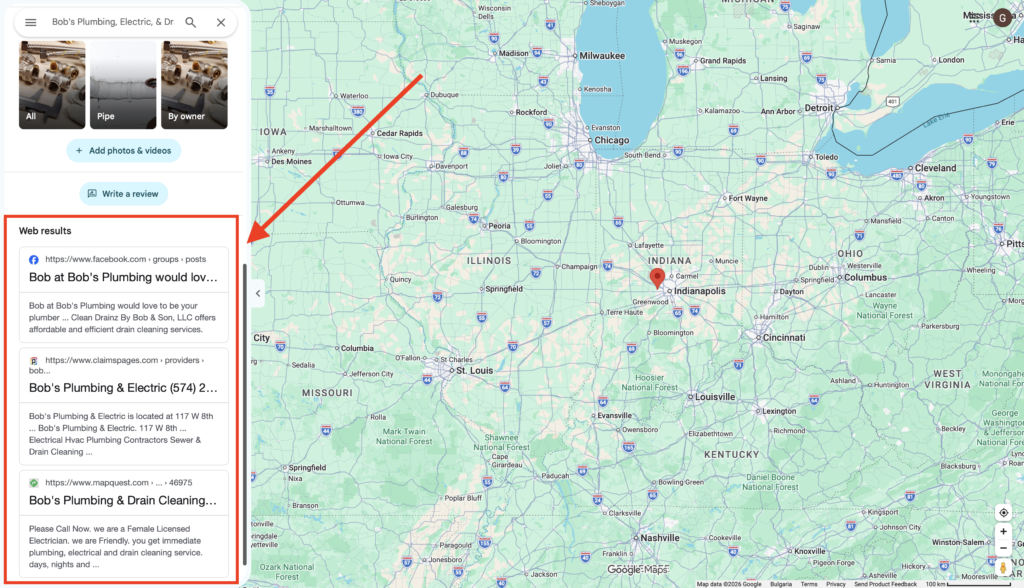
What are Web Results in Google Maps?
You’ll find the Web Results section near the bottom of your local business listing on Google.com/maps:
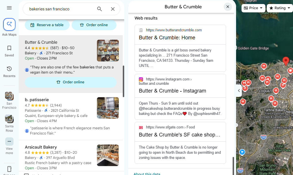
You will find a very similar but distinct segment of three results (without the “Web Results” heading) near the bottom of the “local finder” results in Google.com/search:
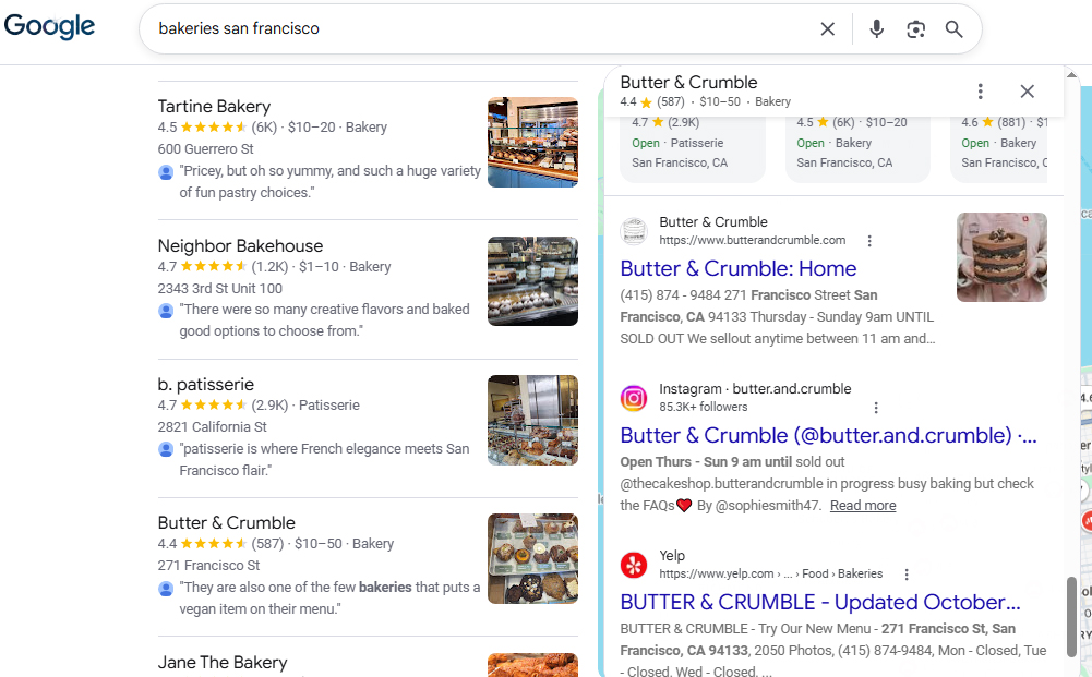
Both versions contained linked mentions that can point to the business’ own website as well as to third-party websites.
Which sites appear most frequently in Google Maps Web Results?
The following table excludes brands’ own websites so that dominant third-party platforms become clear. The third and fourth columns represent the number of business listings on which we saw a given platform appear and how this creates a picture of that platform’s prominence in Web Results.
| Rank | Site | # of Businesses | Share of Prominence |
|---|---|---|---|
| 1 | facebook.com | 8,719 | 41.00% |
| 2 | mapquest.com | 3,849 | 18.10% |
| 3 | instagram.com | 3,470 | 16.30% |
| 4 | bbb.org | 1,692 | 7.90% |
| 5 | linkedin.com | 1,148 | 5.40% |
| 6 | avvo.com | 465 | 2.20% |
| 7 | houzz.com | 446 | 2.10% |
| 8 | thumbtack.com | 424 | 2.00% |
| 9 | wheree.com | 414 | 1.90% |
| 10 | zocdoc.com | 342 | 1.60% |
| 11 | apple.com (Apple Maps) | 334 | 1.60% |
| 12 | carfax.com | 324 | 1.50% |
| 13 | yahoo.com (Yahoo Local) | 312 | 1.50% |
| 14 | nextdoor.com | 300 | 1.40% |
| 15 | birdeye.com | 238 | 1.10% |
| 16 | zillow.com | 227 | 1.10% |
| 17 | waze.com | 217 | 1.00% |
| 18 | serviceagent.ai | 209 | 1.00% |
| 19 | opentable.com | 201 | 0.90% |
| 20 | superlawyers.com | 198 | 0.90% |
| 21 | homeadvisor.com | 196 | 0.90% |
| 22 | lexinter.net | 188 | 0.90% |
| 23 | reddit.com | 158 | 0.70% |
| 24 | angi.com | 135 | 0.60% |
| 25 | usnews.com | 128 | 0.60% |
Worth noting:
- The tail is long – These 25 Web Results top a chart of 5,491 distinct third-party sites; it’s a very diverse data set Google is pulling from.
- Our results skew towards home services – 38% of our data set consisted of brands in the home services industry, so keep that in mind in looking at the prominence of platforms like Houzz and Thumbtack. You should definitely be looking into the specifics of your own vertical.
- There’s a fairly stable pattern of ranking order – Your own website will typically occupy the first slot, but when this isn’t the case, that first spot is most often occupied by Facebook (531 of the businesses in our study) or MapQuest (398 of the businesses in our study).
- Two third-party sites is the most common pattern – 55% of the listings featured two third-party sites in their Web Results, 18% featured one third-party site, 14% featured third-party sites in all three spots, and 13% featured no third-party spot.
An industry-specific breakdown of Google Maps Web Results
As mentioned above, our overall data set skews a little towards home service businesses. Whitespark has lots of experience managing the Google Business Profiles of brands in this industry, but we’re here to support all industries and this table represents the top web results references for multiple major verticals. Again, we’ve excluded brands’ own websites from this information.
| Category | # of Businesses | Dominant Web Results Sites |
|---|---|---|
| Home services | 8,081 | Facebook 48%; MapQuest 24%; BBB 19%; Instagram 9%; Houzz 6%; Thumbtack 5% |
| Medical and health | 3,524 | Facebook 36%; Instagram 24%; Zocdoc 10%; MapQuest 8%; US News 2% |
| Legal | 2,387 | Facebook 32%; Avvo 19%; LinkedIn 13%; Super Lawyers 8%; lexinter.net 8% |
| Automotive | 1,665 | MapQuest 38%; Facebook 37%; Carfax 19%; Instagram 7%; Cars.com 7% |
| Beauty and personal care | 1,147 | Instagram 64%; Facebook 45%; MapQuest 13%; Fresha 7%; Apple Maps 6%; Vagaro 5% |
| Financial services | 1,147 | LinkedIn 31%; Facebook 30%; MapQuest 14% |
| Pets and animal care | 871 | Facebook 61%; Instagram 26%; MapQuest 22%; pawp.com 8% |
| Real estate | 761 | Facebook 43%; Zillow 27%; Realtor.com 12%; Instagram 12%; MapQuest 12% |
| Retail | 733 | Instagram 35%; Facebook 25%; MapQuest 14%; Weedmaps 10%; Leafly 8%; The Knot 5% |
| Food and drink | 402 | OpenTable 50%; Instagram 46%; Facebook 18%; Michelin Guide 11%; Resy 5% |
| Professional services | 356 | MapQuest 48%; Facebook 43%; wheree.com 22%; Instagram 13%; Waze 9% |
| Sports and fitness | 332 | Instagram 56%; Facebook 37%; ClassPass 11%; MapQuest 7%; Mindbody 4% |
Worth noting:
- Instagram is your BFF if you’re marketing beauty, fitness, a retail shop, or a restaurant. It beats out Facebook as a Web Result in these industries.
- MapQuest is alive and kicking as a Web Result for automotive and professional services, edging out Facebook.
- Linkedin is the place to be for financial services Web Results
- OpenTable is the main course for restaurants. This is the only category we explored in which a third-party directory leads outright, being present in half of all restaurant listings.
- The BBB still matters for the home services industry, but it’s not among the top 6 references for any other category we investigated.
Google Maps vs. the local finder
Here, the term Google Maps refers to results at google.com/maps, and the local finder refers to the Places view, which resides on google.com/search. Our study enabled Whitespark to discover that Web Results differ between these two distinct user experiences. The following table offers a small sampling of what we saw in looking at the Maps panel vs. the local finder panel for 5 local businesses.
| Business | Maps panel | Local finder panel |
|---|---|---|
| Applewood Plumbing (Denver) | 1. Brand site; 2. Facebook; 3. BBB | 1. Brand site; 2. Yelp; 3. Facebook |
| Classic Oil and Lube (Dallas) | 1. MapQuest; 2. Carfax; 3. Yahoo Local | 1. Yelp; 2. MapQuest; 3. Carfax |
| LaserAway Austin Eastside | 1. Brand site; 2. Instagram; 3. Wheree | 1. Brand site; 2. Brand site; 3. Yelp |
| Commission Row (Indianapolis) | 1. Brand site; 2. Brand site; 3. OpenTable | 1. Brand site; 2. Brand site; 3. Yelp |
| Bragg Financial Advisors (Charlotte) | 1. Brand site; 2. Brand site; 3. LinkedIn | 1. Brand site; 2. Brand site; 3. Brand site |
Worth noting:
- Local finder loves Yelp but Maps ignores it – 4/5 of the local finder panels featured a Yelp listing but we found zero instances of the review platform being included as a Web Result in analyzing 63,870 Google Maps listings. This is systematic.
- Commonalities are apparent, even in this limited look – There’s significant overlap between the two types of panels, with that notable exception of Yelp.
- The local finder is sensitive to country settings – When we set our location to Canada, the top 3 web results for Applewood Plumbing in Denver were the brand’s website, yelp.ca, and the BBB, but when we set ourselves to the US, the Web Results changed to the brand’s website, yelp.com, and Facebook. While we did not see variance setting our locations to different cities within a country, we did spot differences at a national level.
- The Google Maps mobile app does not display Web Results – While this feature could be informing Google about your brand in the background, it’s not something mobile users of the Google Maps app will see
Web Results stability in Google Maps results listings
Whitespark wanted to know if repeating identical queries would yield identical Web Results. We ran three tests to investigate panel stability.
Test One: 10 Businesses + 10 Identical Requests
We ran 100 total Google Maps queries, using the same request each time across ten different businesses, with the following findings:
- 72/100 requests yielded the same Web Results for the repeated queries
- 1 business in our set yielded the same results across all 10 repeat queries
- The least stable businesses in our set returned five different Web Results lists
- The panel is not a fixed entity; an identical request repeated minutes apart can yield a distinct trio of results, but each individual business draws from a limited pool of possible results
Test Two: 10 Businesses queried from different US locations
We queried these same businesses from New York, Los Angeles, Chicago, Houston, Miami,
Seattle, Denver, Atlanta, Boston, and Phoenix. We found that 75 of 100 queries matched the most common list, and for all businesses, this common list was the same one we observed in Test #1. Location doesn’t appear to increase Web Results diversity beyond the baseline variation.
Test Three: 7 businesses + 100-200 identical requests each
We made 100-200 identical, repeat requests to Google for each business and recorded the 3 web results returned each time.
Key to the table:
- Usable requests – The number of these 100-200 requests that came back with readable listings. For example, for Applewood, 194 out of 200 requests were usable.
- Different sites seen – This is the number of different websites that featured at least once in the business’ Web Results, including the brand’s own website. For example, for Applewood Plumbing, five different sites were seen including the brand’s own website, Facebook, BBB, Apple Maps, and Reddit.
- Most common combination – This column displays the set of three Web Results that came back most often, and in the order they were displayed.
- Share of usable requests showing that combination – This column captures how often the most common combination was returned in response to our requests. For Applewood, for example, the brand’s own site, Facebook, and BBB were returned in 177 out of 194 usable requests, making this percentage 91%. The other 9% of requests showed a different trio.
| Business | Usable requests | Different sites seen | Most common combination | Share of usable requests showing that combination |
|---|---|---|---|---|
| Applewood Plumbing (plumber, Denver) | 194 | 5 | Brand site, Facebook, BBB | 91% |
| Universal Roofing (roofer, Philadelphia) | 90 | 3 | Brand site, Facebook, BBB | 92% |
| Pearl Dental NYC (dentist) | 94 | 3 | Brand site, Instagram, Zocdoc | 85% |
| Brandon J. Broderick (injury lawyer, New York) | 93 | 5 | Brand site in all 3 slots | 71% |
| AK.LUX.NAILS (nail salon, San Diego) | 97 | 4 | Brand site, Instagram, Brand site | 66% |
| Bragg Financial (advisor, Charlotte) | 194 | 3 | Brand site in all 3 slots | 65% |
| Provaré Houston (restaurant) | 90 | 3 | Brand site in all 3 slots | 52% |
Worth noting:
- There are two panel variants – Some businesses (the plumber, the roofer, and the dentist) have a fixed trio of Web Results. Others (the lawyer, financial advisor, and the restaurant) switch between an all-own-sites version and a version with one or two third-party sites.
- For the second variant, a single request often shows no third-party sites – Bragg’s Linkedin page appears for 35% of requests, but 65% of the time, the Web Results are made up of three pages of the brand’s own website.
- Rare one-offs exist – A Reddit thread titled “Avoid Applewood Plumbing at all costs” appeared in 2/194 requests. BBB, Avvo and MapQuest each appeared once per 100 requests for other businesses in our data set.
- The brand’s own site was always present – It was first in all but 3 of about 950 requests.
- Random empties – Between 2.5% and 10% of requests returned nothing for businesses that clearly have web results.
- What this means for the main dataset – each stored trio is one draw, so “Facebook appears for 41% of businesses” is best read as “in 41% of panels on a given view”. The share of businesses for which Facebook can ever appear is higher.
Reddit in the panel
Reddit appears in the Web Results of 158 businesses (0.7%) in our data set, almost always as a specific thread, and usually in the third slot. This table offers an initial look at keywords we queried to discover how many had a Reddit listing in their Web Results and what the share of that keyword is.
| Keyword | Businesses with a Reddit listing | Share of businesses for this keyword |
|---|---|---|
| Moving companies | 26 | 6.60% |
| Pest control companies | 9 | 2.50% |
| Solar installation companies | 10 | 2.50% |
| Electricians | 9 | 2.30% |
| Home inspectors | 9 | 2.30% |
| Garage door repair | 8 | 2.10% |
| Auto repair shops | 7 | 1.90% |
| HVAC contractors | 7 | 1.80% |
Worth noting:
- Mostly city subreddits – Though we saw instances of “ask”-style Reddit entries from subreddits like r/AskNY or r/AskLosAngeles, the most common result was from basic city subreddits. These included r/Austin (14), r/Columbus (10), r/washingtondc (10), r/Denver (9), then r/houston and r/Charlotte (7 each).
- Mostly recommendation requests – 66 of the 158 titles are from Reddit threads asking questions, such as “Looking for electrician recommendations” or “Affordable movers in LA?”. Only about 10 are clearly warnings, such as “Avoid Planet Puff Columbus”.
- Often not about the business at all – Businesses with generic, keyword-style names (“Top Electrician Austin”, “Affordable Moving Company”, “Best Nail Salon & Spa”) get general recommendation threads that match the words in their name. It appears Google is matching generic names to general Reddit queries instead of queries about specific brand names.
- More likely when the own site is missing – The business’ own site is in the panel 54% of the time when a Reddit result was also present vs. 86% of the time across all panel variants in our study.
- Position – A Reddit result occupied the first slot in the Web Results 9 times, the second slot 55 times, and the third slot 94 times.
- Likely undercounted – Reddit can be a rare alternate that a single fetch misses, as with Applewood’s 1% thread.
A Deeper Dive into the Reddit Data
Whitespark was curious about the presence of Reddit in Google’s Web Results, and wanted to establish whether any further patterns were present in the data to help us understand when Google pulls Reddit threads vs. when it doesn’t. Here’s what we noticed:
1. Ratings and review count have no apparent impact – We saw no evidence that better-rated or more-reviewed businesses had more or less instances of Reddit in their Web Results than those with inferior reputation metrics.
2. Industry appears to have the most influence on Web Results’ inclusion of Reddit – 6.6% of all the moving companies in our set featured Reddit threads, followed by 2.5% of solar installers and pest control businesses, and 2.3% of home inspectors, electricians, garage door repair services, auto repair services, and HVAC brands. Note that these are all trust-sensitive and often expensive types of services that consumers are crowd-sourcing opinions on. Meanwhile, Reddit is nearly absent from legal, financial, and medical categories. The attention you pay to Reddit when it comes to Web Results’ citations will be dictated by your industry.
3. There may be a metro-based Reddit bias – City appears to have less influence than industry, but there is a slight tilt towards tech-forward, high-Reddit-usage metros. When looking at Reddit appearances in the Web Results on a geographic basis, here are the numbers: Austin (1.40%), NYC (1.31%), Seattle (1.21%), Columbus (1.13%), San Francisco (1.11%), and DC (1.03%) sit at the top. Texas-non-Austin (San Antonio 0.09%, Dallas 0.18%, Fort Worth 0.19%) and Jacksonville sit at the bottom. As our sample size is relatively small, however, this data should be considered suggestive rather than conclusive.
4. If your business is named on Reddit, it may not be a good thing – We analyzed 146 distinct Reddit threads and found that sentiment on Reddit skews heavily negative when a thread names an actual business. However, when Reddit threads feature generic questions like “who should I hire for solar installation in Austin?” most threads are either positive or neutral.
5. Movers and towers have the most complaints on Reddit – Where a specific brand in these industries is mentioned, Reddit content is negative more often than not. We also saw a lesser number of complaints about appliance brands, auto care businesses, cannabis shops, HVAC, garage door repairs, gyms, locksmiths, medical practices offering Botox, nail studios, exterminators, and solar installers.
6. Age of Reddit threads may surprise you – We manually logged the age of 50 of the Reddit threads that appeared as Web Results. Given Google’s historic emphasis on fresh content, it surprised us to see that the oldest thread in this set was from 13 years ago. The second oldest was from 12 years ago. The freshest content was from 3 months ago and only 2/50 of Reddit Web Results were this fresh. In fact, just 16/50 of the Reddit results had been posted in the last year; the rest were all older than this. The average age of Reddit posts was 30.44 months (a little over 2 ½ years). This suggests to us that Google is willing to scrape very old content about your brand, and if what is appearing on Reddit is unflattering, you might want to brainstorm a way to get some fresher content there.
7. Upvotes were present in all but 2/50 Reddit results – The greatest number of upvotes we saw on any Reddit thread was 879. A second thread had 802 upvotes, and a third had 561. However, most threads featured far fewer votes. The average number of upvotes was 65, but it’s important to realize that this number is skewed by several outlier threads with huge numbers of upvotes. 37/50 of the threads being pulled in Web Results had fewer than 20 upvotes, making this the dominant pattern. Your brand may need some upvotes on a Reddit thread to have it included in Web Results, but it is unlikely that you need a viral amount of upvotes.
8. All Reddit threads in Web Results have comments – The greatest number of comments we saw in a single thread was 394. The smallest number of comments we saw was 4. The average number of comments on Reddit threads featured as Web Results was 42. This suggests that Google may have an activity threshold they are using to determine which threads to feature as Web Results. If you are trying to get a Reddit thread to appear for your brand, it will likely need commenting activity on it.
What can you do if your Reddit Web Results feature negative sentiment?
As we saw in the first data set, 66/158 Reddit threads featured generic titles asking for recommendations of providers in specific cities. Offering the kind of service that gets mentioned as exceptional in these types of threads could help you overcome some of the negative impacts of your Web Results containing Reddit-based complaints about your specific brand. Given Google’s reliance on some extremely old content to fill its Web Results with Reddit threads, it could be worth experimenting with whether a fresher, positive thread specifically about your brand could bump out an older, negative one.
Which of your own web pages does Google Web Results pull most often?
We looked at 27,895 instances of brand’s own websites were being pulled as web results across 18,506 unique businesses with the following results:
- The homepage featured 57.5% of the time
- A location/service area page featured 10.6% of the time
- A contact page featured 5.6% of the time
- An about/team page featured 5% of the time
- A services description page featured 2.4% of the time
- A products/shopping page featured 1% of the time
- A booking/appointments page featured 0.4% of the time
- A menu/food page featured 0.3% of the time
- A pricing/quote page featured 0.2% of the time
- Other pages such as reviews, blog posts, gallery, FAQ, and careers each featured <0.2% of the time
- Where more than one website-based page is featured, the homepage typically comes first, with internal pages following it.
This analysis indicates that it is your informational pages, rather than your transaction-oriented pages, that Google prefers to feature as Web Results. Your homepage is the most important factor here, so be sure yours is telling a compelling story about why your company deserves to be chosen, but there are industry-specific nuances here worth noting.
The inner page Google reaches for to populate Web Results is strongly predicted by industry, as demonstrated by these findings:
| Industry | Notes on pages featured in Web Results |
|---|---|
| Multi-location health/fitness | Location pages dominate – Urgent care clinics pull a location page 48% of the time (homepage only 16%, physical therapy 33%, laser hair removal 32%, dermatologists 28%, mold remediation 25%, fitness gyms and pest control 22%, junk removal 20%. These are chain/multi-branch models where Google correctly infers the user wants *the nearest branch*, not the corporate homepage. The title tag data confirms it, with examples like "Find an urgent care location," "Store locator – Floor and Decor," "Find a chiropractor near you," "Club locations – LA Fitness." |
| Professional services (lawyers, accountants, financial advisors) | About/team pages top the charts – Financial advisors hit about 17%, accountants 15%, cosmetic/estate/criminal/divorce lawyers 8–13%. In trust-based professions, Google surfaces the "who are these people / meet the team" page — reputation is an influential factor for these types of queries, so the bio page is the relevant one. |
| Trades and home services (roofing, HVAC, plumbing, landscaping) | Almost pure homepage (73–76%), with few location/about pages present in this industry. Single-location local operators often have simple sites, so the homepage *is* the whole story. |
| Restaurants | Homepage (71%) + a bit of menu (8%) — one of the only categories where menu pages surface at all. |
| Appointment-driven trades | Contact pages spike for appointment-driven trades — bankruptcy lawyers 13%, accountants 14%, appliance repair/electricians/home inspectors ~10% — where the next action is literally "call them." However, hair salons are the most homepage-heavy at 82%. |
The bottom line here is that Google isn’t picking brands’ own web pages at random. It appears to be practicing intent-matching based on internal logic like this:
- “Which branch?” for industries like urgent care, gyms, med spas, and chain retail → location pages
- “Can I trust them?” for industries like, lawyers, accountants, and financial advisors) → about/team pages
- “Just connect me” for single-site trades like plumbers→ homepage
Unexpected sites in Web Results
Our study turned up some domains that weren’t all familiar to us that we’ll highlight here:
- Wheree.com – This is a directory site which appears to be auto-generating review summaries using AI for businesses for which it has no actual reviews. For example, this page for a branch of Ace Hardware has an extensive reputation summary on it, but no proprietary reviews. A 2026 press release from the company offers this description, “AI-integrated global location search platform, Wheree.com has officially launched with an expansive database of over 10 million locations.The site appears to have launched this year.
- Serviceagent.ai – This is an AI-based front office solution that launched in 2025 and that handles phone calls and bookings for service businesses.
- Pawp.com – This is a virtual veterinary telehealth service that launched in 2020.
- Lexinter.net – This is a US-based legal directory. There is very little founding info readily available on the web about this brand.
Google AI Mode suggests that some of these domains feature auto-generated content. It’s worth noting that (with the exception of serviceagent.ai) these domains never appear in the first position of the Web Results in our data set. The average positions are: wheree (2.43), lexinter (2.54), and pawp (2.76). The average position of serviceagent.ai is 2.40, with it occasionally appearing in position 1. It may well be that Google is backfilling positions 2 and 3 with corroborating evidence of brands when there is an exact match service+city lookup they want to provide a page for, regardless of the quality or years-in-business of the platform.
Rival mapping products MapQuest, Apple Maps, Yahoo Local, and Waze rank among the top 20 platforms being cited by Google’s Web Results. Here is a breakdown of the prominence of these platforms in Web Results
| Platform | # of appearances in Web Results | # of unique businesses with this Web Result | Average position in Web Results | Industries featuring this platform in Web Results |
|---|---|---|---|---|
| MapQuest (mapquest.com) | 3,921 | 3,884 | 2.48 | Towing (256), tire shops (201), locksmiths (178), cell phone repair (171), appliance repair (161), security installers (145), junk removal (134), carpet cleaners (131), pet groomers (124), auto repair (121). For professional/medical brands like lawyers, dentists, dermatologists, and urgent care, MapQuest puts in less than 40 appearances in the Web Results. |
| Apple Maps (maps.apple.com) | 340 | 340 | 2.76 | Tire shops (44), animal hospitals (30), nail salons (28), laser hair removal (27), veterinarians (27), flower shops (19), cell phone repair (17). Apple Maps is nearly absent in the legal space. |
| Yahoo Local (local.yahoo.com) | 314 | 314 | 2.65 | Towing (26), locksmiths (21), tire shops (20), home inspectors (16), fence companies (15), water damage (13), mold remediation (12). Yahoo Local results appear to be heavily skewed towards trades. |
| Waze (waze.com) | 218 | 218 | 2.6 | Cell phone repair (32), tire shops (29), auto repair (15), towing (12). Waze, a driving app, appears most for automotive-related services but it is not a prominent Web Result for professional services. |
It’s worth noting that MapQuest enjoys broad coverage across multiple industries in the Web Results. For context, Facebook appears for 41% of the businesses in our study, while MapQuest appears for 18.1% of them. The other three local platforms in the above table tend to either skew towards particular industries or have a limited appearance in them.
Insurance agents receive interesting treatment in Web Results, as their carrier sites (like Progressive or Liberty) frequently appear on their panels. Here is a breakdown of the carrier sites we saw in our data set:
| Carrier site | Total # of appearances | # of appearances on distinct agent listings | Average position in Web Results |
|---|---|---|---|
| libertymutual.com | 80 | 80 | 2.53 |
| progressiveagent.com | 41 | 40 | 2.34 |
| nationwide.com | 38 | 37 | 2.08 |
| travelers.com | 31 | 31 | 2.52 |
| mercuryinsurance.com | 29 | 29 | 2.17 |
| statefarm.com | 22 | 20 | 1.23 |
| freeway.com | 20 | 8 | 2.05 |
| acceptance.com | 15 | 5 | 2 |
| erieinsurance.com | 12 | 12 | 2.17 |
| allstate.com | 7 | 5 | 1.43 |
| farmers.com | 6 | 3 | 2.17 |
| aaa.com | 4 | 2 | 1.75 |
| hagerty.com | 4 | 4 | 2.25 |
| geico.com | 3 | 3 | 1.33 |
| acuity.com | 3 | 3 | 2.33 |
| germaniainsurance.com | 3 | 3 | 3 |
Here’s a live example of the type of carrier page the Web Results are featuring for a single insurance agent. Given the prominence of this type of result in this industry, agents should:
- Advocate to carriers for as much control as possible of their listings on carrier sites
- Regularly check these sites for basic accuracy, such as contact information, especially if the agent moves to a new location, gets a new phone number, or changes their business hours
- Encourage carriers to make these pages as detailed as possible to improve conversions
Where a platform that is unfamiliar to your brand is appearing in your Web Results, you should research it and discover the degree to which you can influence the content being shown on the landing page.
The roles of reputation & rank in Web Results
Earlier, we looked at the characteristics of Reddit threads appearing in Web Results. Now let’s look at a broader picture of how positive/negative sentiment is being featured in overall Web Results.
Interestingly, our study found that it is the content of Web Results landing pages that is more frequently negative than the titles of those pages. Titles were positively-leaning about 6.8% of the time and negatively-leaning only 0.05% of the time. Titles used neutral language (like “Adrar Insurance Agency llc Phoenix, AZ – Progressive Agent” or “Laurie Insurance Group LLC, Charlotte, NC | Nationwide” ) about 93% of the time.
This picture alters, however, when we look at the textual snippets that appear below the titles of Web Results. The following table looks at occurrences of negative sentiment on specific platforms and being displayed in the textual snippet portion of Web Results:
| Platform URL | Total # of negative snippets | Total # of overall snippets | % of negativity |
|---|---|---|---|
| bbb.org | 1,005 | 1,712 | 59% |
| reddit.com | 9 | 162 | 5.60% |
| avvo.com | 7 | 465 | 1.50% |
| facebook.com | 25 | 8,863 | 0.30% |
| mapquest.com | 5 | 3,921 | 0.10% |
| houzz.com | 3 | 446 | – |
| linkedin.com | 3 | 1,160 | – |
| instagram.com | 3 | 3,536 | – |
What emerges from this data is that the BBB stands out as a negativity engine. Further investigations suggested that this is because their page templates literally contained words like “complaint,” “complaints,” “file a complaint,” and “customer reviews” on nearly every page — so a 59% “negative” rate is partly boilerplate, not necessarily a scathing review of that specific business.
While you should always be attempting to provide the kind of customer service that results in a great reputation, you shouldn’t worry too much in seeing BBB Web Results featuring words like “complaint” because this language is baked into their display.
One statistic of note is that our examination of 1,712 total BBB listings within Web Results found that the phrase “not BBB accredited” appeared 571 times (about 33% of the time). Many consumers still rely on the BBB as a trust indicator. If this is the case with your customer base, taking the time to get BBB accredited may well be worth it as seeing that non-accredited label could be off-putting.
When it comes to whether rank impacts the types of Web Results panel shown, Whitespark identified a minor pattern worth noting. Here are three aspects of this:
1. Higher-ranked businesses have a “healthier” panel. The closer a business is to the top of the Maps results, the more likely its panel contains its own website (89.8% → 83.5%) and recognizable mainstream platforms (Facebook, BBB, Reddit all tick down with rank). These are businesses with a real, established web footprint, so Google has quality first-party and major-platform pages to show.
2. Lower-ranked businesses lean on thin directories to fill the slots. Because the panel always needs 3 links, when a lower-ranked business *lacks* a strong own-site/social presence, Google backfills with programmatic aggregators — thin-directory share climbs from 6.3% → 8.8% as rank falls. The ~6-point drop in own-site presence is essentially replaced by scraper-directory pages like (wheree, serviceagent.ai, etc.).
3. Reddit skews slightly toward the top. Top-3 businesses are nearly 2× as likely to have a Reddit thread (1.17% vs 0.65%) — consistent with higher-ranked businesses being more prominent/discussed, so there’s more organic conversation for Google to surface.
The final question: Which profiles are worth having in the Web Results context?
In this study, we’ve looked at:
- Prominent Web Results across the board
- Prominent Web Results platforms by industry
- Outliers like the Google Maps vs. Local Finder results
- Stability of the results
- The Reddit phenomenon
- Unexpected Web Results
- The role of reputation and rank in Web Results
When determining how to respond to the prominence of Web Results on Google Maps listings, the good news is that repeat data fetches suggest that there is a small pool of possible results from which Google is pulling for any, individual businesses. The best workflow here is to:
- Look at industry patterns of the sites being most commonly pulled as Web Results
- Do repeat searches for your own brand to document the Web Results appearing on your listing over the course of a several days or weeks
- Take a robust management approach to any sites you can directly control or influence with that pool of identified Web Results for your business.
What emerges from this study is a narrative of control vs. the lack of it. Sign up with your email below to receive our free checklist for maximizing control over your Web Results.
Professional local business listing development is an investment with multiple returns. It not only influences the quality of your Web Results in Google Maps and the local finder, but citations have come to the fore in the AI era for their ability to feed tools like ChatGPT and Google AI Mode. Even small local businesses can struggle to develop their location data for a single-location brand, and complexity scales with every subsequent location the company opens. Whitespark can help with:
- Local business listing development
- Our Yext replacement service
- Our Google Business Profile reinstatement service
A clean, broad, well-managed digital footprint is a kind of insurance across multiple consumer interfaces, including Google Maps Web Results, local pack results, local finder results, organic search results, and conversational AI. Getting your sources of truth right directly impacts what prospective customers see everywhere they go across the web. It’s an investment every local business should prioritize for the sake of profitability.